Friday 28 October 2011

TCR # 82 X-mas Wallhanger + blog hop at Colorful Krafter, US

It's Halloween in some parts of the world, in other parts like ours, it's just a regular weekend though quite a few shops are making their best to whip up some spooky feeling.

My colourful scrappy friend Rebekah in Florida, US is having a Halloween bloghop for the next 4 days. I'm sponsoring 3 full sets of Prima Alla + Prima Ledger 1 and Prima Ledger 2 papers for those who visit my blog and leave a comment on any of my posts. Then go back to Rebekah's blog and say you have been here.

Check out Rebekah's cool gargantuan crèpe paper spider HERE

Your next Halloween Blog Hop Stop is
Shelley ~ Scrappergirl

Friday also means it's release time for a new palette over at The Color Room. This week we're in Her Room with the beautiful colours Purple Passion, Sequin white with a hint of blue, Party Pink and Silver Bells.

This palette is another one of TCR's featured in the Swedish Magazine Inzpira Magazine (www.inzpira.se) which was released this week. It is a gorgeous Magazine and contains some serious eyecandy along with recipes and oodles of other yummy stuff!!!!!


These colours are really opposites of the traditional Scandinavian Christmas colours of red, green, gold, white and brown, but oh so pretty and so wonderful to work with.

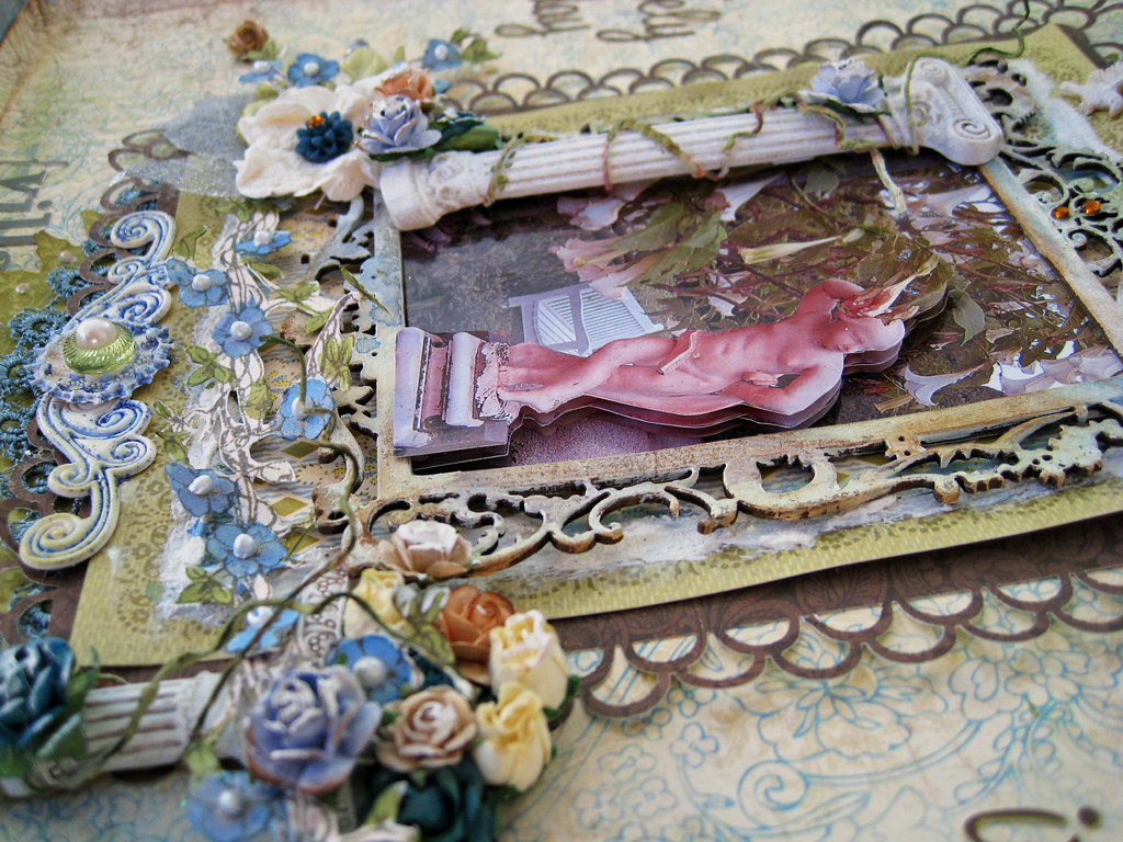
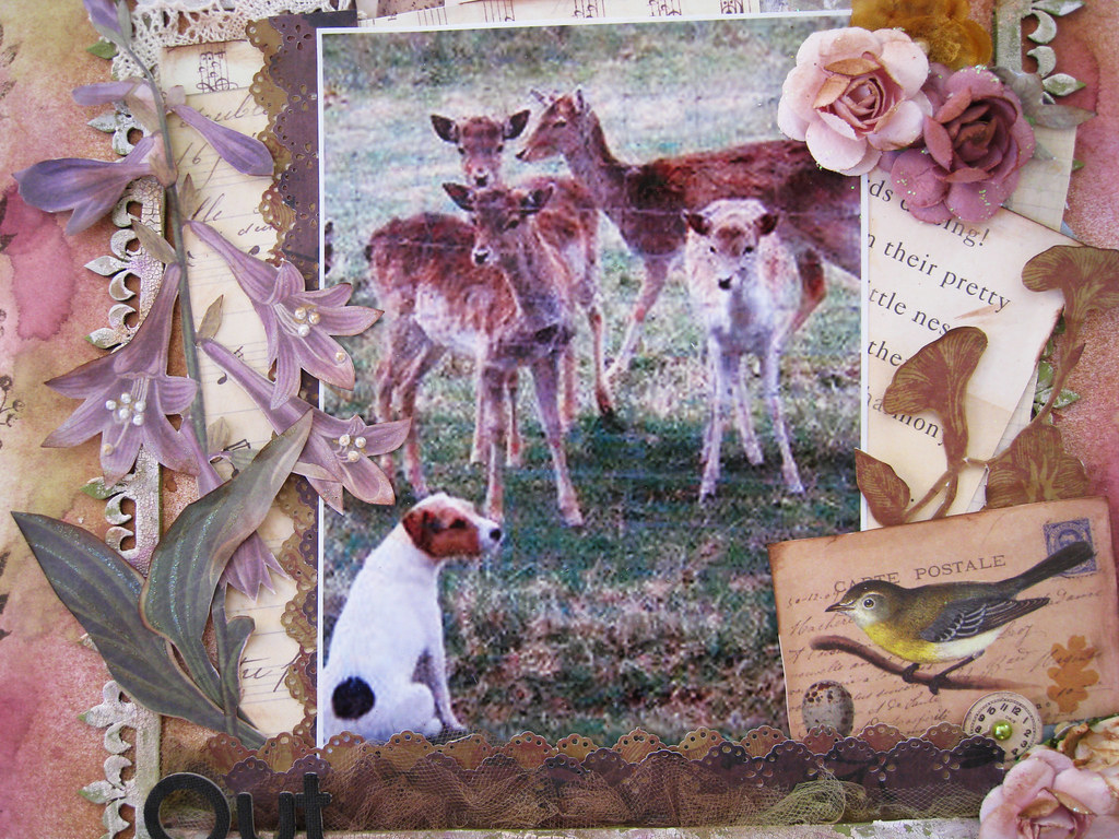
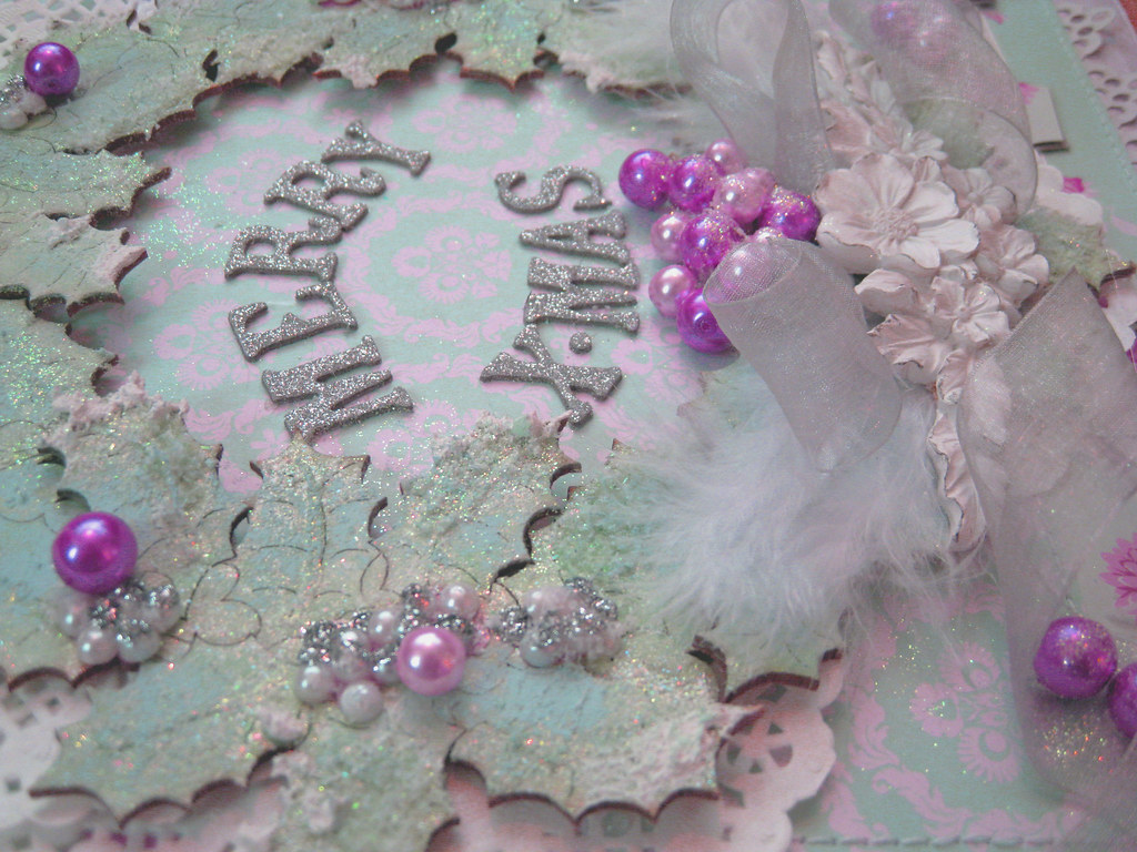
This is what I came up with; a Christmas wallhanger that will be framed and hung in our living room in December.


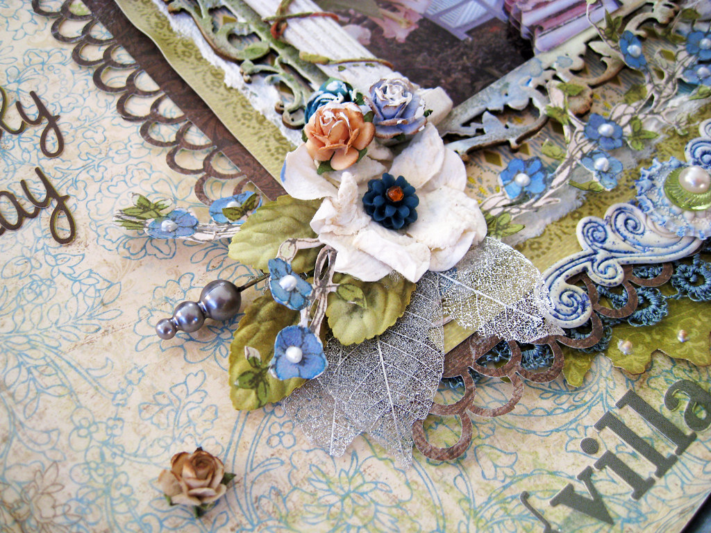
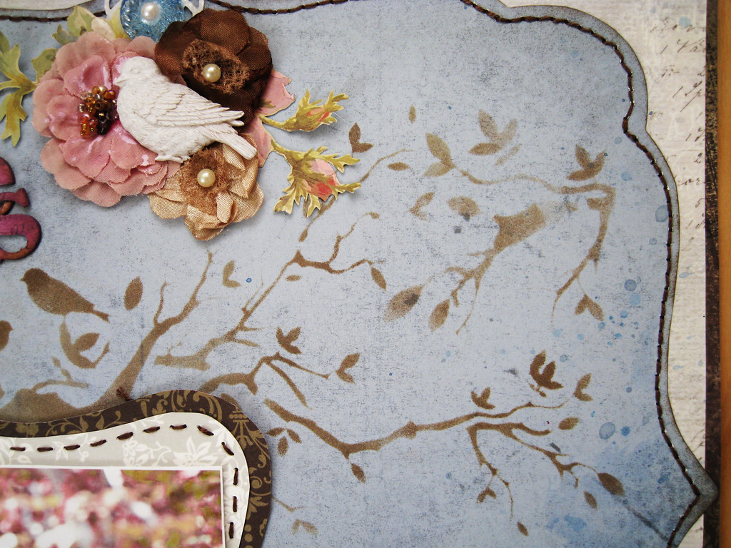
All the papers are from Danish Tilda and a mix from a couple of different earlier collections. I never stop wondering how on earth the same page can have so many different hues depending on which angle I've photographed it or how close I've snapped the pic. I promise, it is the one and same page.

#82_X-mas wallhanger 4000px-2

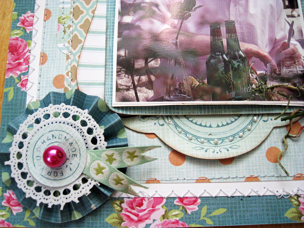
Here I've used a resin decoration from Melissa Frances as my main central embellie. Under it I have two white feathers and a silver grey chiffon ribbon. Pink and purple pearls piled on top of each other (takes a really good and strong stone glue to fix that without all the pearls falling apart). Kaiser Craft doilies tucked in around and under the wreath.

Here you can also see the Pink Paislee Artisan music sheet paper that I misted in Vintage Pink and chalked the edges in Rosebud. On top of it is a doily paper in pale grey from DCWV. I cut off the central really pretty lacey bit and saved it for later.

#82_X-mas wallhanger 4000px-3

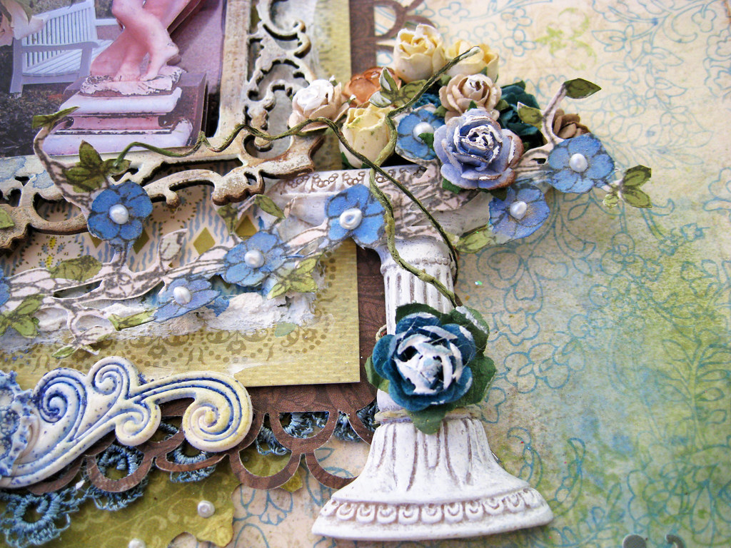
The chippie wreath is from French online store Embelliscrap  WHICH YOU CAN FIND HERE.
It is made on special order and comes in a creamy colour that can be altered as you like.

I put in quite a lot of paint work on the wreath; first I whitewashed it in diluted white acrylic paint. Then I dabbed it randomly with an ice blue dabber from my stash. Let it dry and then I painted it in Shimmerz Blingz in Winter Garden before white-washing again in diluted white acrylic paint. Let it air dry.

As finishing touches I smeared out Stickles Star Dust over all surfaces and then traced some lines on random leaves in Stickles Crystal. After that had dried, I smeared on my beloved "snow paint" on the tips of random leaves and when that had dried, I glued on Flower Soft in Polar White.

Lastly I glued on white semi-pearls and Stickles Silver before adhering the Pink and Purple pearls when the Stickles had dried.

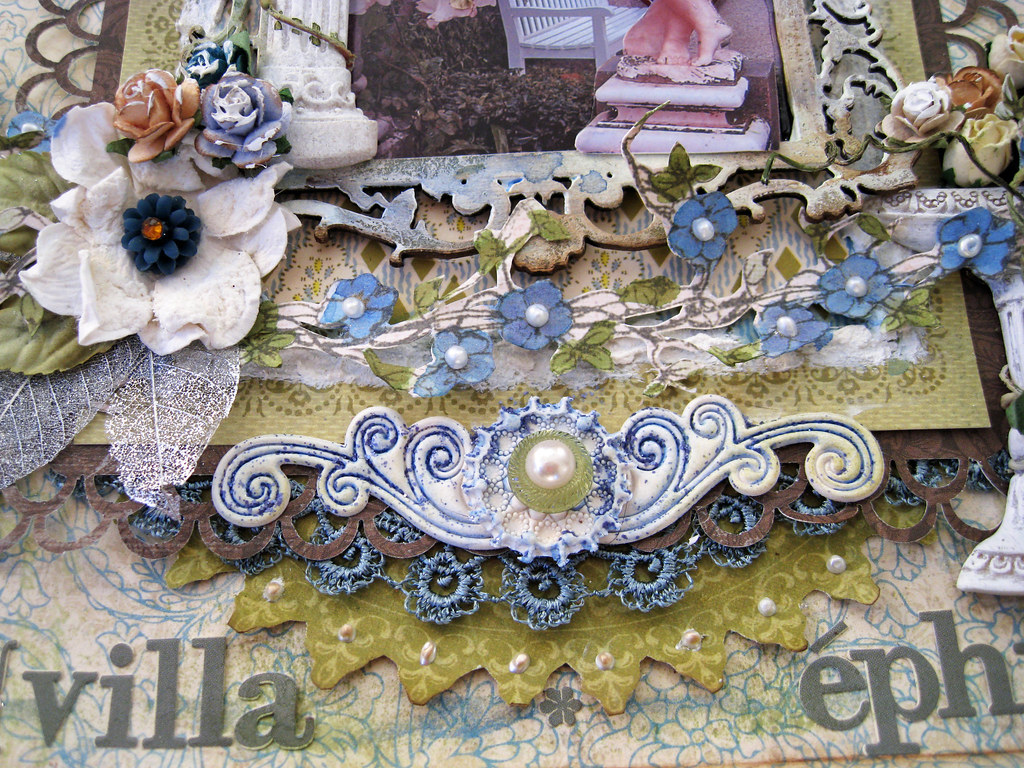
The silver alphas are American Crafts.

#82_X-mas wallhanger 4000px-4

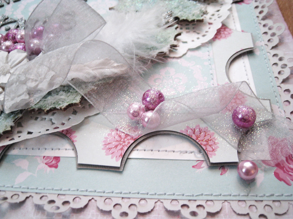
I used a circle punch but only half way in to punch out the inverted "scalloped" border. Then I matted the 5th paper layer in silver grey Bazzil cardstock before tracing the scallops with a scissor.

I used a glue pen to touch up the pearls before pouring glitter on them, some of the glitz stayed on the chiffon ribbon and sparkles really prettily IRL.

#82_X-mas wallhanger vers 2 4000px-5

And with all this sparkle and shine still fresh in your memory, we've come to the end of this post.

Thanks for your visit and for leaving lovely comment! Happy Halloween to ya all! Have a wonderful scrappy weekend!

xoxoxox Eila

Monday 24 October 2011

Once Upon A Sketch 15 October Challenge - "Ooops - watch out!"

Hello again!

Had a wonderful scrappy weekend and for the first time in ages, I could also play along at Once Upon A Sketch.

Here's Nadia's pretty sketch. I've turned it sideways to fit in my photo, moved the embellishment spots too, but the large central area is still there.


Journalling criteria: A most embarrassing/awkward/uncomfortable moment or characteristic/feature/habit/mannerism/quality or quirk you or someone around you possesses. Journal at least 2 SENTENCES on a moment that you will remember for all the wrong reasons.

The journalling criteria has to be combined with the sketch.

Hmmm ... as I am very controlled person, I very rarely get embarrassed about anything. Nor do I end up in awkward moments. However, there was once that I went to the ladies' room in the office and when coming out, my very sweet co-worker U immediately pulled me aside and whispered that my skirt had accidentally got caught up into the back of my pantyhoses. Voilà! there they were, my granny knickers to behold for anyone coming up behind me. Gosh, that's one of those moments but I really didn't want to scrap my knickers tee hee ...

However, clicking through my photos I found this one. Earlier this summer I wrote about how DH and I had been to a fabulous exhibition on exquisite designer dresses and costumes. Well, the museum has a garden with an outdoor café cum summer restaurant. It was a lovely lovely day so hubbs and I decided to have ourselves a shrimp salad and a cold drink.

OUAS 15OCT2011 challenge 4000px-main

Now doesn't this look idyllic? All the papers are from the latest collection by Danish Tilda.

OUAS 15OCT2011 challenge 4000px-2

Check out that life size model of an owl that sits on the roof behind DH. It's there for a reason!

OUAS 15OCT2011 challenge 4000px-3

Took myself a couple of the classes over at Miss Art's Papercrafting school during the weekend, one of them is "Fabric Frills" featuring Andrea Budjack. Gerry van Gent has a class on "Clay Creations" and there are many more illustrous ladies teaching fabulous stuff!

I really do recommend a visit to http://missartspapercrafting.com/classes

For the first time ever, I made that rolled-up fabric flower. Looks more like a lopsided dotted teal bun but hey, practice will make perfect one day!

The cute brown and white felt blooms are from Precocious Paper's Etsy shop that you can find HERE

OUAS 15OCT2011 challenge 4000px-4

Cut one of the labels in half and placed one above the pic and the other one under it. The rose is a die-cut.

OUAS 15OCT2011 challenge 4000px-5

I made the accordion bloom from one of the Tilda papers. Attached a white doily from Leean Pearce's Chip Chop Shop and on top of that, another die-cut from the Tilda collection and a fuchsia coloured pearl just like a cherry on a cake. The ribbons both under the accordion bloom, and under my fabric bloom, are from the Tilda collection.

And now to the punchline of my eeky moment:

OUAS 15OCT2011 challenge 4000PX-6

The darned birds had of course figured out a long time ago that the café was a splendid place to get a free meal, took a loop above DH and I. Just as I was about to tuck into my salad, a very unwelcome greeting ended up on my plate and that was it. Brrrr! Will make sure to sit under a parasol next time we decide to enjoy an outdoor lunch!

The chippie birds are Dusty Attic. I cut off about 1/3 of the row of birds and inked them in Tim Holtz Distress Ink in Black Soot. The "branch" is a stripped Prima Summer Carnation Vine and splattered it with white acrylic paint. Well you get the picture I'm sure ;)

I loved having you for a visit, thank you very much! Take care and have a great week!

Cheers! xoxoxo Eila

Friday 21 October 2011

TCR #81 A Lovely Day

Good morning lovely ladies!

Once again it's Friday and the weekend is waiting around the corner. What a fantastic week it has been, I've been riding on a wave of energy the whole week. Work is good, life is good, I'm good too!

Friday means release time over at TCR and this week we're in His Room. Here's the gorgeous palette of Basic Grey, Bright White, Olive Green and Steel Blue. I just looove the Missoni-inspired pillows piled up in the sofa! and that's what inspired me to use the blue and green as mains in my page.


DH and I spent an extended weekend in Nice, Côte d'Azur by the Mediterranean in France some years ago. Very nearby is located Cap Ferrat where the jet setters scoot around on their humungus yachts. This was the place to be seen in even 100 years ago when the Rotschild family built a divine pink summer villa, a mirage perched high up on the cliff with views over the sea. The villa gardens are a miniature copy of the ones of the Versailles palace, utterly lush and dreamy.

#81_A Lovely Day 4000px-main

This pic was taken in the villa gardens. I thought the marble statue and the huuuge white "angel trumpets" growing around it give such a fantastic and a little mysterious feel of a Secret Garden.

So lots of fussy cutting and misting on this one!

I have used 3 backing papers; first layer is white Bazzil cardstock that I misted a frame on. Used TA glimmermist in Olive Vine and Sweet Clover.

The second layer is a steel blue paper from Swedish designer Pion Design.

The third and top paper is BoBunny Welcome Home. At the Ingvild Bolme workshop that I've mentioned in an earlier post, she taught us to fold the paper about 1,5 cm into it, i.e. folding downwards towards the table thus leaving a sharp edge that could be lightly touched up with chalk. I used Chestnut Roan. When folding back the paper one gets this effect of a subtle frame. I also misted and splattered the page in TA Glimmermist Olive Vine + Sweet Clover + Fall Breeze and Glacier.

I also used chippie corner flourishes from Imaginarium Design that I misted in the green and blue hues that I've used throughout my layout. Finished by dotting on some silver and brown liquid chalk.

#81_A Lovely Day 4000px-2

The brown punched paper is from KaiserCraft Hunt&Gather. The olive green matting is Anna Griffin Francesca as is the patterned blue/olive one that peeks out under the chippie frame. You can see it a bit better further down in the pic with the fountain. The flourished chippie frame is the same that I used in one of my previous pages for Les Papiers de Pandore, the autumnal one with the stacked photos of the cress flowers.

This time I primed the frame in white acrylic paint and then misted it in TA glimmermist Glacier and Fall Breeze + Olive Vine and Sweet Clover. The white stuff that goes around the photo under the frame, is my beloved "snow paint".

The two little birdies perched up at the top come in the same pack as the Prima resin fountain. The crest at the top centre is a BoBunny trinket that I Gessoed a bit and then placed a glittery silver alpha R on top of it (R for Rotschild of course).

The resin pillar is one of Prima's latest releases. I took a Prima summer carnation vine and pulled off the flowers and then wound a couple of the tendrils around the pillar. Then coloured it lightly with TA glimmermist in Suede, used a very fine-tipped brush. The rose is from my stash, very lightly brushed some Gesso on it with my finger tip.

Everything was pop-dotted heavily to add dimension as you will see a bit further down.


#81_A Lovely Day 4000px-3

Silver skeleton leaves, a grey stick pin, some leaves from the Prima vine that I had stripped. I dismantled a white large gardenia, leaving only the centre bit. Added a resin bloom from Webster's Pages to it and popped a brown jewel at the top.

#81_A Lovely Day 4000px-4

Here you have a better view of the blue/olive Anna Griffin paper that I mentioned earlier. Resin fountain from Prima and Gessoed Prima roses. Some more of the Prima summer carnation vines.

#81_A Lovely Day 4000px-5

This is a rather heavy page IRL, lots of stuff on it you know! Don't know if you can see that I have printed out 3 copies of the photo, silhoutted the statue and pop-dotted it to make it stand out from the bottom photo.

#81_A Lovely Day 4000px-6

The stickers are all Webster's Pages, superduper alphas that work beautifully on any layout in my opinion. The centre white/blue flourish is a PinkPaislee Artisan Element that I have stickled with TH distress stickles in Faded Jeans. Looks a bit bright when photographed, but IRL it has a muted steely blue hue. Another round tiny Artisan Element and an olive green Rose and Pearl Sparkler from Webster's Pages on top of it. Under the punched brown matting, I have used steel blue lace and under that is an olive green fussy cut semi circle from an unknown scrap of paper. Liquid pearls running around the circle.

And finally the fussy cut sweet blue blooms which are from Prima Pixie Glen and not blue at all to begin with. I used a very fine-tipped brush and painted them several times in TA glimmermist Fall Breeze and Glacier. They were pink and beige before I painted them. Liquid pearls on each little bloom, both here at the bottom but also at the top of the page. The leaves were hand-painted in TA glimmermist Olive Vine.

With this I thank you warmly for popping by, so lovely having you for a visit! Have a wonderful weekend peeps, take care!

Cheerio! xoxoxo Eila

Sunday 16 October 2011

TCR #80 Adorable and Sweet + a layout just for me

What a glorious weekend it has been! For the first time in weeks, I had a day off from work on Friday. Cannot say what I did, time just went by in a blissful haze of nothingness. Oh, I do remember one thing: I bought myself a really nice black DKNY bag. Have had a really tattered old thing that I've loved for years, and it has served me faithfully, but there is a point when that doesn't help. Thank you AmEx and because I am worth it!

I spent the whole of Saturday creating my layout for TCR #81. Felt so good to finally have all the time in the world and a little bit more. Have to say I was rather chuffed at the result. I'll share it with you next Friday.

Now back to this Friday's TCR release which was #80. Here's the inspo photo with vibrant colours such as Magenta Pink, Absolutey Apricot, Warm Beige and Pool Blue. All colours, except beige are my toughest challenges in a palette.


I made this page right after I got back from Zürich and had so little time to do it in. Admittedly far from one of my better ones, but have a look at the gorgeous apricot peachy silk lollipop blooms in the middle of the cluster!! They were in the surprise package that I got from sweet darling Lean de Ruiter the week before I left for my trip. Aren't they just so luscious! Thank you Lean, and Chippie of course who was moral support for mummy while she was creating them.

#80_Adorable and Sweet 4000px-main

The peachy paper under the black one, is the reverse side of an old WP paper. The black one could have been black cardstock, but as I had none, I took what I could find and that was the reverse of a paper from MME Meadow Lark. The creamy one is Crate Paper.

#80 Adorable and Sweet 4000px-2

Here they are, the beautiful apricot silk lollipops! The pretty girl is the daughter of some friends. You've seen her previously in my TCR #67 You.

#80_Adorable and Sweet 4000px-3


#80_Adorable and Sweet 4000px-4

And now to the little something that I made just for me. Say hello to Buster the doggie, checking out his neighbours! It's the same little chap as in my TCR # 55A A Dog's Life and in one of the pages I made for Les Papiers de Pandore, "Going Home".

Checking out the Neighbours 4000px-main

First I started with the DA chippie frame because I knew it would take some time to dry. Primed it in white acrylic paint, then misted in TA Olive Vine + Sweet Clover. Then followed a couple of purple hues before I spread TH crackle paint in Picket Fence in a thick layer on it.

Then to the background. I started with a white cardstock that I sprayed semi lightly with water, and then followed a misting bonanza with TA Suede + Juneberry Wine (gosh I do love that colour) + Spring Violet + Pashmin + Lavender Fields, as well as the same greens that I had used on the frame. Even if I zapped the paper with my heat gun, it took considerable time before the paper had dried and then it was anything but flat. Anybody got a tip on how to avoid the paper warping and wobbling?!

Checking out the Neighbours 4000px-2

The patterned papers used are K & Co Flora & Fauna and the black alphas are my current faves from Prima.

The brownish/greenish "grass" is tulle that I have misted. I borowed the idea from wonderful and supertalented Helen Tilbury who shared the tip on her blog some time ago, she had used a predominant green for her grass. I have also punched out a couple of strips of the same hue from some Flora & Fauna papers that I layered up behind the tulle.
Checking out the Neighbours 4000px-3

Some Prima and KaiserCraft roses, and a couple of ephemera pieces from K&Co Flora & Fauna.

Checking out the Neighbours 4000px-4

Fussy cut details and elements from the same Flora & Fauna collection and a piece of cream lace from my stash tucked in.

Checking out the Neighbours 4000px-5

My hands look as if I've got some weird disease, all splotched in purple and brown. Really so great to see how the mists are beginning to end up where I want them to be and to look the way I had in mind.

My colourful scrappy friend Rebekah in Florida, US is hosting a blog hop over Halloween (starting 27 October). I am one of the sponsors for Bekah's hop. Check out her blog which you find HERE

This girl works magic with her sewing machine and she has an Etsy Shop where she sells gorgeous stuff, have a peek HERE

It's still a beautiful autumn day in Stockholm, about +8C and sunshine. Just had a text message from DH who is on his way home from his weekend with the boys. Pizza for dinner has a rather tempting ring to it ...

Thanks for your visit and lovely comment! Take care, be good - toodeloo!

xoxxo Eila

Monday 10 October 2011

With love from Switzerland + TCR #79 Like Apples on the Trees and greetings from Holland

Gruessi ali lueti! as the good citizens of Zürich would say. To ye English speaking I bid hello!

From icy winds and rain in the capital of Switzerland to dito in my hometown, no question about it - woollies are here to stay!

I was cooped up in a conference room for 3 days and by the time we were let out, it was almost dinner time. I was a naughty girl and skipped the last two workshops on day 2 just to get some fresh air. Took the tram down to the Old Town which is located at lake Zürich. With the excruciatingly strong exchange rate of the Swiss Franc, shopping was out of the question.

Zürich 7OCT2011

Just like a postcard even with dark skies and icy winds. Lake Zürich in the background.

Zürich 7OCT2011-2

A residential street in the Old Town.

Zürich 7OCT2011-3

And with a photo of the opposite side of the river Limat I say bye to Zürich and head over to The Color Room where palette #79 was released last Friday.

This week we have Purple Passion, Tan Hide, Pale Grey and Dusty Blue to challenge us and here is the inspo picture. Loved the combo but the Purple Passion turned out to be a really tricky colour for me.


Loved the blue paper from KaiserCraft Hunt&Gather, which then decided the layout for me. The original backing paper is the same brown paper, also KaiserCraft H&G, that you can see as matting under the photo. However, as I have serious problems photographing square despite all the tips I have got, I had to crop the photo thus leaving hardly any of it to be seen. The grey paper is from Swedish Pion Design.

#79_Like Apples in the Trees 4000px-main

Some of you might recognize Miss T whom I've scrapped several times before. Her mother told me that the photo was taken last summer (2011) at the Swedish Royal family's summer residence Solliden which is on the island of Öland. A right royal tree in other words!

#79_Like Apples in the Trees 4000px-2

Have bought a couple of new masks from Crafter's Workshop, this one with the branch and birdies is one of them and immediately became my new fave. I used a finger sponge to stipple TH distress ink first in Antique Linen and then in Vintage Photo. I think it gives the image a soft and hazy feel.

The large alphas are BoBunny Etc and I have misted and chalked them in several hues of purple and brown.

#79_Like Apples in the Trees 4000px-3

I just love the dappled light in the pic. Gosh how that girl has grown in the passed year!
#79_Like Apples in the Trees 4000px-4

Some brown/grey/tan flowers from Prima's new collections. A blue heart from Webster's Pages. A Prima pearl swirl from my stash and some cut out flowers from a piece of scrap of really old unknown paper. The photo is double matted in brown paper from KaiserCraft Hung&Gather and the grey/white is from Anna Griffin Georgette Collection. I made a fan from that same grey/white paper and placed it in the cluster.

#79_Like Apples in the Trees 4000px-5
 Here's some more of the beautiful mask and the top cluster with Prima blooms and resin bird. The blue rose and pearl Sparkler is from Webster's Pages.

Talking about sparkling, the postman brought me a wonderful surprise last week from the lovely bubbly and gorgeously beautiful Lean de Ruiter in Holland. I will soon share some of the content of this package with you. Her sweet and clever doggie Chippie had also sent a little something to her admirer in Stockholm; a card with a view of her beloved beach! Thank you so much girls!

Card from Lean de Ruiter OCT2011

 And with a view of the endless sky and sea I have also come to the end of this post. Have the next weekend to look forward to, hubbs is going away on an all-boys weekend with his chums so I have the computer all to myself! Cannot wait to catch up on my long overdue blog visits.

Till then, thank you dearly to those of you who haven't given up hope on me and have left lovely lovely comment even if I haven't been able to visit your blogs for quite some time! Reading them gave me energy to go with a smile to work - thank you!!

Have a fantastic week! xoxoxo Eila

Saturday 1 October 2011

TCR #78 A Lifetime of Duty and GDT at Scrap-it-Lah

Crazy crazy week and another one waiting around the corner! Took a day off from work yesterday, Friday and did absolutely nothing. Sat in the sunshine at a café sipping my latte and checking out people scurrying about.

This week's conference went super well, got another one coming up on Tuesday and then bye bye, I'm off to Zürich (Switzerland) on Wed + Thur + Fri. I'm a boardmember of something called EUMA (European Management Assistants) and it's time for our AGM. Some wild 350 chicks of varying ages meeting up to discuss this and that about our profession, 'cause that's what I do for a living; I'm a PA. I have a special place in my heart for the ladies from the UK, been to their training days and have met them on several occasions in London.

Anyhow, it is the time of the week when TCR releases the new palette. This week we are in the sun room with gorgeous soft colours; Pink Putty, Candy Pink, Celery Green and Deep Cornflower Blue. Totally yummie! Here's the inspirational pic for you:


When I first saw the palette I was dead sure I would end up with a layout with pink as main but that's the beauty of the creative process, anything can happen along the road. I never have a clear picture in my head of the end result, ever so often it's nothing like what I started with and this one's exactly that.


It was the blue and green patterned paper from Anna Griffin's Francesca collection that chose me. I just love this photo of my DH's paternal grandfather, who was called Melker by the way. He looks so important and rather pompous, very proud of his position as head accountant at a rather posh Swedish estate in the 1930's and 1940's. This pic was taken in the early 1930's. The pattern of the paper reminds me of silk ties from that era, lovely lovely soft and muted colours.
#79_A Lifetime of Duty 4000px-2

The floral and paisley papers are also from the Franscesca collection. The brad with a typewriter is MME L&F 2 - my absolute fave collection at the moment! Brown alphas are Prima, the crocheted flower is from a local store. The ledger paper/bill is from Australian online store Maxine's Melange.

#78_A Lifetime of Duty 4000px-3

Don't know if you can see it but there is a chalked imprint of a doily in the bottom right-hand corner, ever so subtle. Resin frame from a local store and stamped clock face mounted in it. Keys are from Tim Holtz and symbolize the keys to the safe and grand dads drawers in his office. The white buttons of course stand for his impeccably starched white shirts.

#78_A Lifetime of Duty 4000px-4

Black old-fashioned handwriting is on an overlay from Maxine's Melange and the rub-on next to it is from BoBunny Etc. Lock and key are TH and the resin crown is from a local store. Coffee dyed scrunched up tag.

#78_A Lifetime of Duty 4000px-5

The fussy cut bloom is also from a Franscesca paper. Cannot remember where the ephemera book cover is from, perhaps K&CO Flora&Fauna?

And here's Mr Melker himself. Gosh I can see his features in my own hubby, jolly nice my own man hasn't inherited any of his grand dad's primness even though it was handed down to his own son, my DH's dad.

#78_A Lifetime of duty 4000px-6


I am also really excited to share some news with you: I was asked to be the October GDT over at Malaysia's first non-profit challenge blog, Scrap-it-Lah, where gorgeous, kind and talented Helen Tilbury is DT. Fantastic and arty Amelia Khalik, beautiful ladies Azura Alyssa, Fon Mee, Helene Sierman, Nadia Jalil and Yatie Tajudin are the other DT members.

Have a peek HERE

The October challenge is to include old book paper, sheet music or something similar downloaded off the internet & printed out + fussy cutting + hand-stitching using embroidery floss.

Well, I often have hand stitching and definitely have fussy cutting on almost all of my pages. I used printed out sheet music from internet to make the leaves as well as for layering in the cluster under the pic.

Scrap-it-Lah 1OCT2011 4000px-main

This is my DH as a baby and his mother, the pic was taken in the autumn of 1961. The chippie flourish has only been painted in white acrylic paint and then touched up with chalk in Chestnut Roan before I added some white pearls and liquid pearls in teal.

Scrap-it-Lah 1OCT2011 4000px-5

Love that white overlay from Hambly! The yellow ochra paper that I've used for the punched and pleated border is MME L&F 2 as is the checkered paper under the photo. The brown second layer is from K&Co Flora & Fauna. The reddish-brownish flower "stamens" are Viva Decor liquid pearl in bronze and copper.

Scrap-it-Lah 1OCT2011 4000px-6

I used brown alphas from Prima on the twill ribbon, the dark teal brads are from MME L&F 2. Teal stitching with embroidery yarn around the whole page. Some TA splatter and scattered teal bling.

Scrap-it-Lah 1OCT2011 4000px-4

All the fussy cut flowers and green leaves are from K&Co Julianna. The teal roses are Prima.

Scrap-it-Lah 1OCT2011 4000px-3

Teal pearl swirl from MME L&F 2.

Scrap-it-Lah 1OCT0211 4000px-2

And here's the proud mother and her bubba boy.

Better get going with my Saturday chores. Have a lovely lovely weekend!

xoxoxox Eila